A few weeks ago I wrote about picking up a pen and some watercolours after more than two decades of not drawing at all. Since then, I’ve kept going.
As I’ve continued, I’ve noticed a few things change. I think more deliberately about which lines deserve emphasis and which can fade into suggestion. I’m also more open to exaggeration and memory, even when they diverge from what’s strictly there, and less inclined to treat that divergence as a mistake.
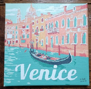
Over Christmas I also tried something completely different: a paint-by-numbers kit I’d been given as a gift. It uses a very different part of my brain to sketching. There are no decisions to make about colour, shadow, or perspective — just the quiet, physical work of getting paint into sometimes tiny shapes. That lack of choice let me focus entirely on hand-eye coordination, and I found that unexpectedly calming. Less expressive, but more meditative in a way my own sketching isn’t right now. It takes a lot longer though.
The rest are my own sketches
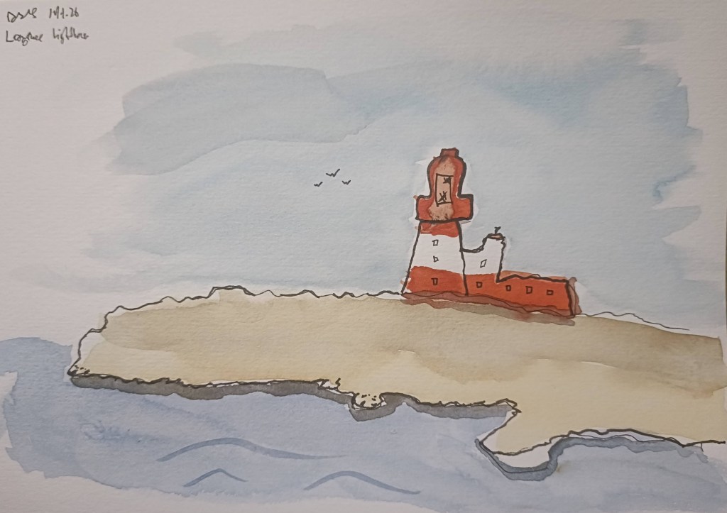
One of my favourites – simple, with a limited palette.
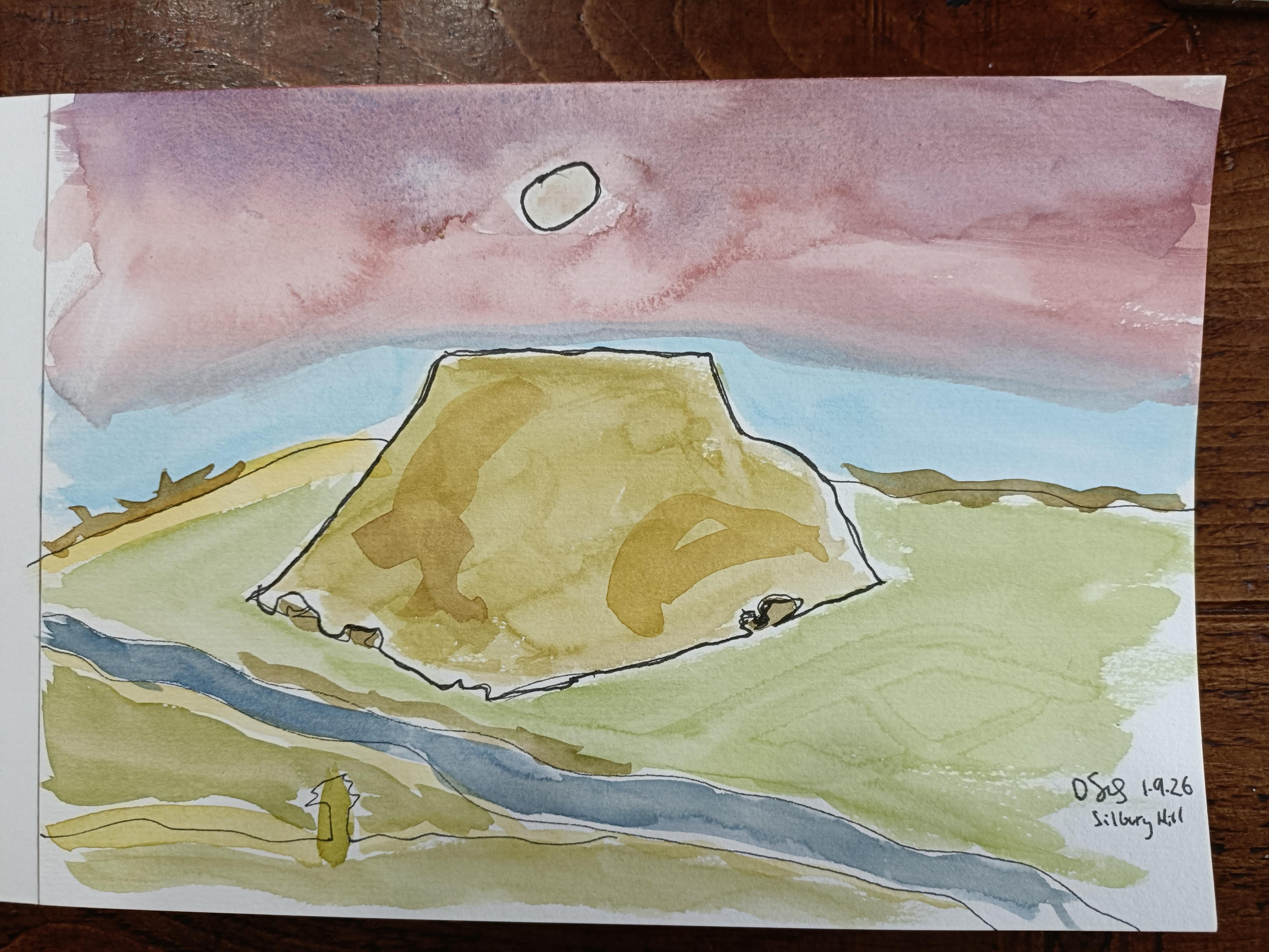
I was most focused here on capturing the colourful sky, and also on drawing a landscape rather than a building.
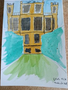
The framing of the south side of Hardwick Hall is something I love to see. I’m happy with the hedges and grass here, but this could be improved by better capturing the depth of the building itself.
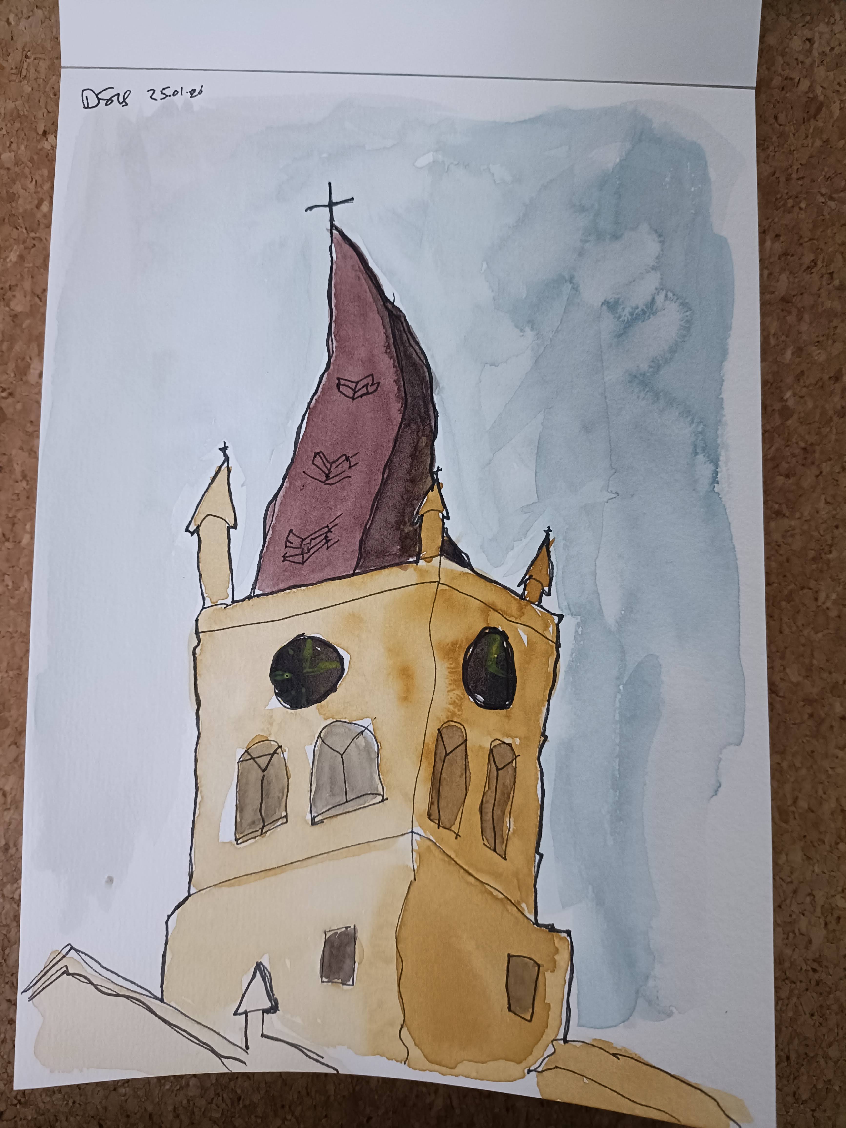
I’m happy with this one. The clock faces are something I’d simplify and lighten next time.
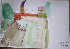
There’s a lot going on here. I regretted adding the Crooked Spire almost immediately, but the house in the background worked well and is something I’d like to explore more.
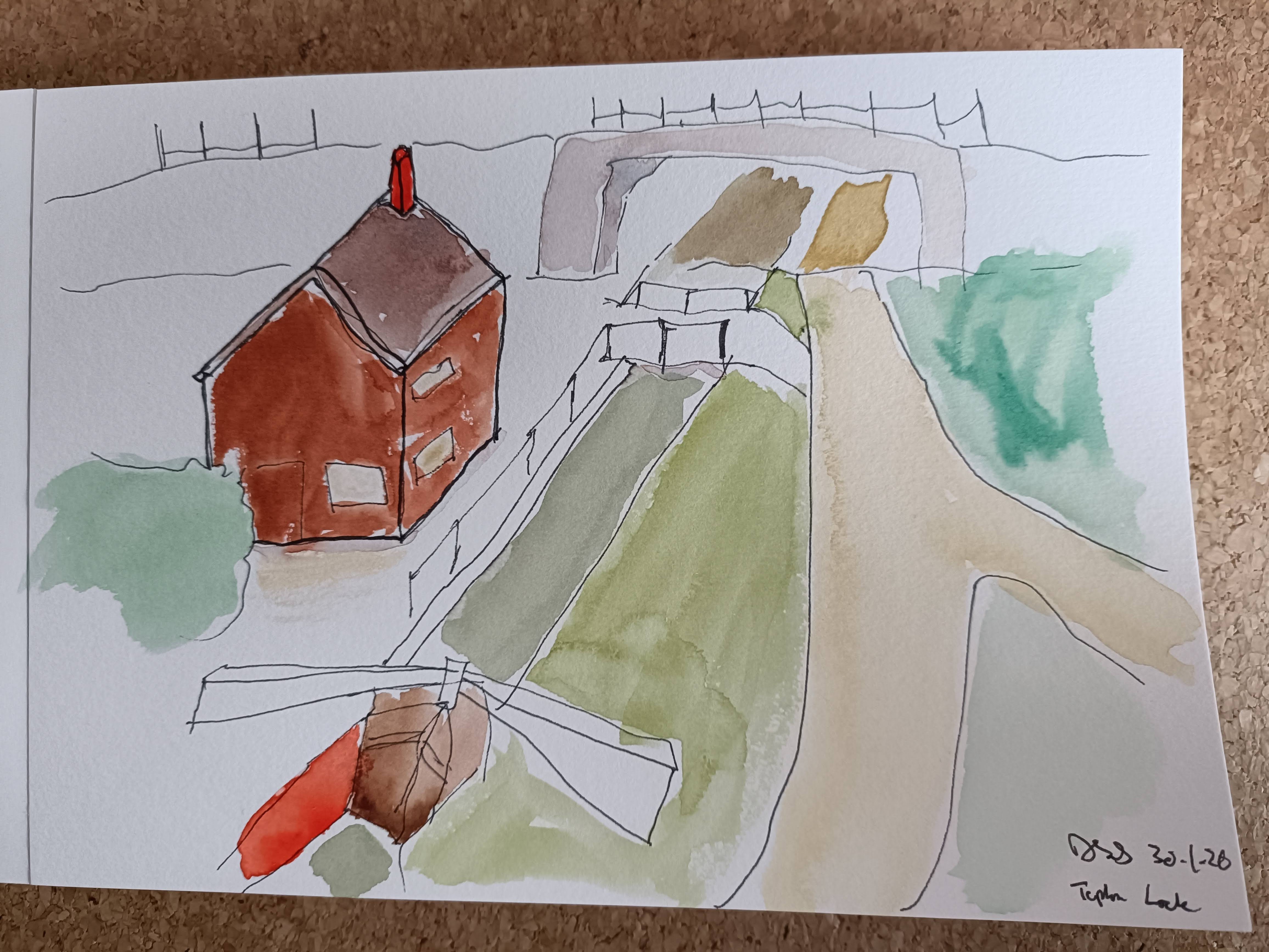
This feels like an improvement in terms of perspective and depth. I like how the bridge reads as shaded and solid.
I don’t know how long I’ll keep going. For now, I’m enjoying the act of making something small and imperfect, and that feels like enough.

Leave a comment